Thursday, 2 May 2013

Use of new media technologies.


For this coursework project I have had chance to experiment with new software and equipment that I have never used before which has been a huge learning curve and very interesting. However I also used technology that I was already very experienced with, which helped to make elements of filming quicker.
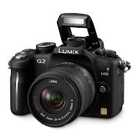

The Camera we used fol filming was the Panasonic Lumix G2. We decided on using this camera because it was something that I already owned and use often for photography, so I know how to use it well and that it is a reliable piece of technology. It also has the capacity for HD recording, something that the camera's offered by school do not have. I also own a tripod, which was well matched to the style of our video, as we required lots of stationary, tilt and pan shots.

One of the problems we had with camera unfortunately was the zoom function. At some point something sticky has become trapped in the zoom lens  making zooming slightly jilted. Not giving the smooth effect that I desired. However this was sorted and the shots were changed on the editing sweet to cut out any jolts or knocks that it caused. Which in the end turned out to be a good thing, as the effect worked brilliantly!

After capturing footage, we used the editing suites that the college provided on order to start putting our music video together. Providing the editing program Adobe Premier Pro CS5, college gave us access to industry level editing software. Something that opened up our options heavily in the process of editing. Other programs such as windows movie maker could be used for create a music video, however they only give opportunity for the arrangement of video clips, and some small alterations to transitions etc. Using CS5 gave the opportunity for the use of layering, split screening, colour correction and many more useful effects that other editing programs do not offer.

We also had the opportunity to use a specially designed machine that helps even further with making editing easier. The tower including processors to help avoid any situations were people loose work because of a freezing etc. It also helps to avoid any jumpiness that may occur if the RAM of a smaller computer was trying to deal with all the data.

Here is an example of how we used split screening on the editing suite to create an effect that could not be achieved using a program such as movie maker.

We took three different sequences of video, (that were filmed in the same location so lighting was the same) each with a different colour filter edited onto its layer to match the running theme of each characters colour throughout the video. We then stacked the images above/below one another, each on there own separate video track. The next step, is to apply a crop effect to each layer; before editing it to the desired cropped effect. Remembering that the layer on the highest track will be the one that shows above the ones bellow it. This technique can be seen in the photo above, were we have used three different layers with a crop to create a face out of our love battling characters.
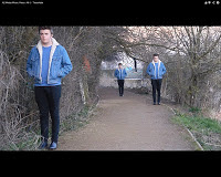

We used this technique three times throughout the video, and found it one of the most challenging things to do however, the rewards and the change it can make to a video are worth it.


The next prominent technology we used was the x-box 360. I often listen to music on the x-box as it can be hooked upto the Itunes on my computer, and sometimes liked to sit and mess around with the album art effects. Which is how I found the music visualizer. Throughout our video there is use of psychedelic effects that match the idea of abstract and tessellation. People have assumed that these were projections, however we filmed them and then edited them into the video afterwards.


Although the above video shows the visualisations it is not all together the same as the ones we used specifically for our video, as they were customised to the Tessellate song.

Although during this project I used Photoshop a high amount, I would not consider it something that is new to me. I have used it countless amounts of times before as I study photography and it is a key part in the editing of photo's. However I feel it is worth giving a brief mention to, at it played a big role in the overall finished product of my magazine cover etc.
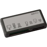
Using this card reader was the next piece of new technology I used. After transferring photo's from memory card, to pen drive, to hard drive for years in photography I realised it would be hard to keep doing this, especially as every device has to be checked on the computer for viruses which is a lengthily process and takes up time that could be used for editing. By using this card reader it made transferring film straight from the camera onto the computer so much easier and convenient  However, one of the problems we faced was the used of small memory cards. As the video is HD it takes up lots of memory, and we had to use several different cards all with different shoots on. This was very problematic,  especially for my partner who was in possetion of the memory cards as I had the camera. However it was still lots more ideal then having to keep transferring data, and much harder to lose then a pen drive.

A final new technology that I used, was a strobe light! Although these may seem not very technically advanced, there was huge problems that came along with the use of a real strobe light for filming and not editing it in afterwards. Getting to grips with having the light flashing whist trying to keep the camera framed, have the protagonist singing to camera and making sure the video was in focus was one of the most challenging things of filming. It took lots of team work to over come the difficulties, but the end result is brilliant and I am pleased we continued to persivir rather then giving up and just using the editing suite. It gives much more of a realistic feel to the video.

Evaluation: In what ways does your media product use, develop or challenge forms and conventions of media products?

To start answering the question, I referred back to the original research on codes and convention of media products that I did during the planning of my video. Looking specifically at the Genre I was aiming for.

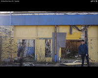
The genre I was aiming for was a more alternative/indie theme. As this is the genre of the song, and I feel that  my video needed to reflect this as the target audience for the song would not be interested in a video that conveyed and different genre. So there for my video does includes some of the expected conventions of this genre, however I also wanted to break some of the 'expected' influence on my video. To do this, I used a narrative for the video. A classic love triangle theme (were two boys are fighting over a girl), Also I added and element of abstract to the video, including shots of scenery and other inanimate things; that could be used to not directly show a story, but influence the mood of the video and convey feeling to the viewer. We used mise en scene that reflected the distant mood of the characters. For example a derelict building, representing the broken down relationship, and emotions of the characters. We also used lots of outside space and natural lighting so the video felt more raw and emotional rather then such a studio setting that would not convey the emotion we were looking for. For example, the use of A river shot fading in and out whilst a hand held camera follows the protagonist. Suggesting the calm of his previous relationship,and beauty before the water is broken and ripples appear. Representing the break up and his struggle to let go of her. This is something loosely take from the video At Home-Crystal Fighters. Which also falls into the 'Alternative' music category. It uses the idea of a loose narrative, with an abstract quality also.

 I have also included some montage within my video, this is a good example of using a convention that is popular for other music video's within the alternative genre. The lifestyle that matches the idea of and alternative lifestyle is that of being somewhat unconcerned with anything except having a good time. Using montage was also a good way of conveying how confused and undecided our characters were, and quick jumpy shots are hard to take in and analyse, like the love triangle featured in the narrative of my video.

Performance is also another convention that we used within our music video, as a general rule alternative video's tend to include a small element of this. We decided, although our video includes three characters  To focus on our main protagonist Sam to do performance, and he is at the centre of our story and the lead vocal on the track is a male.
A video that I found helpful, and that included both of the above conventions would be If we're still alive- Slow club. Their video is heavily abstract, yet still includes large elements of performance. Although their video does not include a narrative.


Editing was a massive part of our video. To achieve everything I talked about above, getting transition between shots, or including effects when needed was vital. Something so simple as whether a dissolve, or jump cut is used can effect an audiences whole perception on the video.
We used several editing techniques within the video to add/take away from the emotion of a shot. We also used it to help match transitions to the beat of the music, something that played a big part in the effectiveness of our video. In the first the opening shots of our video, we combined a fade to black effect, with a jump cut to the next scene. Also matching the beat of our music carefully and working to introduce the main three characters and suggest their roles within the narrative.

One of the more complicated editing techniques that we used was to split screen. This is something that requires lots of time, patience and skill on the editing machine. When doing our research I found a video by Radio Head that shows a very impressive use of split screening, something that we replicated in our video.
Two certain parts in this video stood out to me as something I wanted to replicate and we did it successfully.
(1.13-1.22) Use of split screen to have half of the shot in real time, and half in slow motion. Creating a sense of surrealism, and something not often used. This would be counted as breaking one of the usual conventions.
(3.28-3.35) The use of studio lighting to create a ghostly sense in the video, and use of fade transitions.


Here was our first attempt at replicating the use of fading shots and dim lighting. We later changed it in the final edit of our video. Improving the smoothness of transitions. I think the use of this is something that goes against the usual conventions of a music video, especially one that is following a narrative with performance.


We also used split screening in two other parts of the video.
In This part of the video we had Sammi running towards Sam in slow
motion, using the technique of split screening we were able to have Sam
turn away in normal time. Although we were slightly limited by the editing software, the effect turned out well and is much like the first example I gave of the Radio Head-Street Spirit video.


Breaking Conventions.
Inter textual reference. by KateMarieHannah on GoAnimate


We used from 6.38-6.42 of the clip below in our music video, Over the lyrics,
"Three guns and one goes off"
However we slightly extended the last couple of second to make it fit the music perfectly.


A perfect example of breaking classic music video codes and conventions. This is something that would not normally be done in a music video of any kind. Let alone one with such a eclectic mix of themes, and use of standard codes and conventions.

I think In my music video I have managed to strike a perfect balance between classic media codes and conventions of a music video. The use of a narrative has always been popular in music video's, however adding it together with abstract, performance, and montage is something that is rarely done. But We have managed to pull off well. I am extremely happy with the balance that has been struck.

Saturday, 27 April 2013

Ancillary text, Digipak front cover.

Below is the development of my digipak front cover.


For my first edit I started off with something simple and easy on the eye. It is low key, and the main focus in one area the center of thr image. Which is were the writing is featured. I think this is important, as if a cover is too heavily emlished it is sometimes hard to atually work out what the album is for, or who the artist is. This way it is clear who the artist is, what the single is, but the design is still eye catching and draws your attention.
On the cover I have included the use of actual tessellation withing the boarder of the triangle. This is something I wanted to do because i subtly ties to the theme/name of the song, and is something we reffered to heavily within the music video.


Here is my secod edit. On this I have changed my band name, as I found out that we were not aloud to use the original band name for copyright reasons. This was a slight hastle because all of the stylized writing had been fitted around the spelling of "Alt-J" however I had not drasctically changed my band name and in the end the writing managed to fit in well. I have also added some more embelishment to the boarder around the triangle, then changed the opacity lighter. I did this becasuse I wanted to add something more interesting to the image, without distracting from the whole idea of the traingle, and writing being the center focus of the cover. For a long time I was planning on having this as my final cover.


This is the fiinal didgipak cover that I have decided on. I have added some loose tesselation to the two outside edges of the cover, as I felt it still needed something more. I did this using the line tool on photoshop and carefully placing in the lines to creat a very apealing pattern.
I love how after reading the initial writing, your eye is not quite certain were it should be looking. This is something that will keep and audiences attention for longer, and attract it more in the first place also! My favourite part about this cover is how I have broken conventions of what would be classed as normall for an CD cover.

Friday, 26 April 2013

Inside left page digipak.


Below shows the development of my left inside page for my digipak. I gradually used my images to create a very individual, and though provocing peice of work I think. I made sure that my final step was to add green, red and blue to the image. As this was a big component to the theme of my video.


For my inside page I used several diffent images, and photo shopped them together to create one final image. I wanted to create something slightly surreal and intersting to stimulate people's imaginations.
However I felt it also still needed to reflect the video.


Thursday, 18 April 2013

Wednesday, 17 April 2013

Magazine Advert


In this poster, I have changed alot from the original. After deliberation,  I decided that the coloured image I had included was a little too 'out there' and may have acted as a deterant for people reading the poster, and there for narrowing the possible audience it could reach. I also noticed some spelling mistakes I had made, which will need correcting.
Even though I have replaced the main image, I still wanted to keep the black and white image in some form. I have done this by giving it a lower opacity and giving it a more spooky effect.
 
 
This was the next development of my film poster. I have added some more text to the poster as I think it was just too simple, As the whole point is for it to advertise the release of the song. I added a release date, and a review that I made up which may atttract people to the poster more. However I still feel like something about the poster is not there yet, I want to develop it further, and hope to make it look more professional.


This is the first idea I came up with for my poster. It is very simple and eye catching which is what I wanted to achieve. I also wanted to make it clear what the poster was advertising. I also felt that I needed to stick with a simular theme behind my video. To do this I used traingles, in a loose form of tesselation. I also included a photo of Fran a charecter from my video, I did this because I felt that using a photo of the protagonist was a little too much, and Fran plays a central role in the video as she is the source of the love triangle dilemma she faces in the video.